Color is not just a visual delight in our everyday lives; it’s a spectrum of emotions and expressions. Think about it – we often describe our feelings using colors: seeing red when angry, feeling blue when sad, or turning green with envy. This emotional connection makes color an incredibly potent tool in interior decorating. It’s the quickest and often most affordable way to alter the character and value of your home.
Whether you’re contemplating a vibrant paint job, introducing new window treatments, adding accent wallpaper borders, updating carpets or floors, or making other interior or exterior improvements, color has the transformative power to revamp any space, large or small.
Setting Your Color Goals
Before diving into a color overhaul, pinpoint what you want to achieve. Do you wish to make a space feel larger or cozier? Are you aiming for an energizing or a calming atmosphere? Just as businesses use specific colors to influence customer behavior (like using vibrant orange in restaurants to stimulate appetite), you can use color to evoke certain feelings in your home.
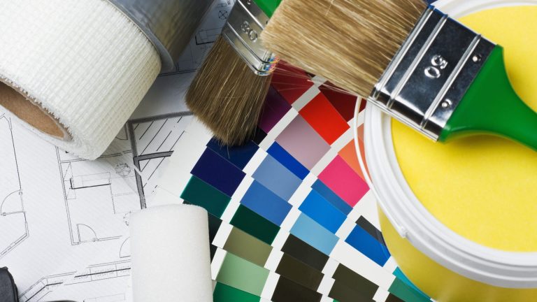
Choosing Your Palette
Trends in color, much like fashion, ebb and flow. While the last decade saw a return to bold, spicy colors like emerald greens and deep reds, the timeless neutrals always maintain their charm.
Selecting colors for your home is a commitment; it’s something you’ll live with daily and should potentially appeal to future buyers. People touring a home often visualize their belongings in the space; overpowering colors might hinder this process.
Colors can also appear differently depending on their surroundings and lighting conditions. A color might radiate warmth in natural light but seem less inviting under artificial lighting. Similarly, a color that appears vibrant and lively in a well-lit area may look subdued in a dimmer space. Neutral colors can act as a canvas, coming to life with splashes of bolder colors.
Balancing and Contrasting Colors
While an entirely red room might be overwhelming, red accents can inject drama and interest. However, high-contrast combinations, like red against white or green, can be visually jarring.
Colors not only influence the look of a room but also our psychological state. Blue, for instance, is known for its calming effect and is a top choice among adults. Green is synonymous with tranquility. On the other hand, warmer colors like reds and oranges create a sense of intimacy and warmth.
Decorating with Color: Tips and Tricks
- Warm Colors: Reds, yellows, and oranges can make a space feel more intimate and cozy.
- Cool Colors: Greens and blues are calming and make small spaces seem larger.
- Light and Cool Tones: Ideal for expanding and brightening small spaces.
- Dark and Warm Tones: Perfect for making large, sparse rooms feel more inviting.
- Neutrals: Offer flexibility and adaptability for any furniture style.
- Ceiling Colors: Lighter than walls to raise a ceiling, darker for a lower effect.
- End Walls in Hallways: Painting them a darker color can shorten the perception of length.
- Furnishing Colors: Use colors to adjust perceived room size and add drama.
- Camouflaging Techniques: Paint elements like radiators the same color as walls to blend them into the background.
- Color Flow: Aim for a cohesive color flow from room to room for harmony.
Color is a dynamic and affordable way to transform your home and reflect your personal style. With thoughtful selection and application, you can create spaces that not only look fantastic but also resonate with your emotions and preferences.